I spent much of Sunday in Westminster, Md. helping Katherine prepare for the opening of her new show at McDaniel College’s Rice Gallery. The show — Slurry — opened on Feb. 21 and runs through March 16. We (well, Katherine mainly) spent many hours taping down the expansive piece that you’ll see creeping across the gallery floor and up a wall if you visit. While we were packing the car, I had some fun taking periscope photos of the rolled-up paintings. Click on the slideshow for a larger view of the photos.
It’s 6:59 a.m. in Aspen, Colorado. Elevation: 7,945 feet. I’m on a tongue of groomed powder at the base of a ski spot that overlooks downtown. A pack of about 200 Lycra-clad racers fidgets behind a blue line spray-painted in the snow. The horn will blow any second.
I glance down and around. I’ve never seen such an array of footwear at a starting line. To my right, a scatter of ski bindings, from Nordic to randonée. To my left, a woman fusses with snowshoes. Ahead: a burly guy in jerry-rigged Nike trainers.
But then again, I’ve never run a race quite like America’s Uphill. It’s 2.7 miles of brutal snow-covered slopes beginning at the bottom of the Aspen Mountain Gondola and ending at its 11,212-foot summit. The race offers a 3,267-foot climb—more vertical than the world’s tallest building.
Racers can use whatever gear they want, and some come better prepared than others. Just days off a jet from Washington, D.C., I’m one of the others. My wife is concerned that I will keel over midrace with mountain sickness. I kiss her forehead saying, “I’ve done marathons before. How hard can a few miles be?”
I’ve long believed that less is more when it comes to footwear. My shoes: Puma racing flats enveloped by a tangle of rubber and metal. Yesterday, I’d shelled out $60 for attachable crampons. The web of 3/8-inch steel spikes slips under the wafer-thin soles like a net. I’m in the “Open” division, a catch-all category that includes shoe stabilizers, Yaktrax, and the like. The other three categories are track skis, telemark skis, and alpine touring (which includes alpine and randonee bindings).
The horn blares. The pack begins to ooze across the starting line. Only a handful of us are running. Most are engaged in more of a waddle. I’m taken aback. I thought this was a race, not a charity stroll. I vow to maintain at least a shuffle.
But quickly the reality of the mountain—and the thinness of the air—hits me. Hard. The race has barely begun, but I can hardly breathe. I feel like I’m drowning. Ten-thousand feet up, high enough that each lungful contains only three- quarters of the oxygen I would get in D.C.
As I head higher, I play mind games to keep moving. I shut my eyes, count steps, tell myself there’s a serial killer chasing me. I imagine I’m wearing rubber boots and slogging through puddles of paint inside one of my wife’s paintings. It helps.
So does turning and looking back. Just after the halfway mark, the view, which had been blocked by a row of trees before, spreads out around me like a tapestry of green and white. Whole ridges of mountains in the distance, imposing from the ground, look like anthills from up here.
I draw strength from the view, and soon I’ve made my way up through a narrow notch in the path that opens up to an area where the morning light, a huge pool of gold, sparkles across the top of the mountain. I start to feel euphoric. For maybe 10 minutes. My heart, meanwhile, is thud- ding three times faster than it should. Each breath is sandpaper on my windpipe.
Toward the end of the race, my spikes feel like they’re chiseling nails through the soles of my feet. Finally, I see the Sundeck Restaurant perched at the sum- mit. I rush toward it. In the last stretch, which flattens out a bit, I accelerate to a shuffle. When I cross the finish, the clock reads 1 hour 17 minutes—right in the middle of the pack. Normally, I’m in the top 15 percent.
My wife hugs me. Sheepishly, I admit: “Those were the toughest 2.7 miles of my life.”

A new NASA study underscores the fact that greenhouse gases generated by human activity — not changes in solar activity — are the primary force driving global warming.
The study offers an updated calculation of the Earth’s energy imbalance, the difference between the amount of solar energy absorbed by Earth’s surface and the amount returned to space as heat. The researchers’ calculations show that, despite unusually low solar activity between 2005 and 2010, the planet continued to absorb more energy than it returned to space.
James Hansen, director of NASA’s Goddard Institute for Space Studies (GISS) in New York City, led the research. Atmospheric Chemistry and Physics published the study last December.
Total solar irradiance, the amount of energy produced by the sun that reaches the top of each square meter of the Earth’s atmosphere, typically declines by about a tenth of a percent during cyclical lulls in solar activity caused by shifts in the sun’s magnetic field. Usually solar minimums occur about every eleven years and last a year or so, but the most recent minimum persisted more than two years longer….
A Less Hardy Hardiness Map

The USDA has unveiled a new version of its plant hardiness map, which gardeners use to gauge which plants will survive in which climate zone. (Check your nearest seed packet.) In the newest iteration, many zones have shifted northward because winters aren’t as cold as they were 22 years ago when the agency last updated the map — good news if you’re trying to grow, say, figs in Boston. On the new map, most parts of the United States are a half-zone warmer — about 5 degrees Fahrenheit (2.7 Celsius). Global warming surely underlies much of the change, but theUSDA points out that more sophisticated mapping techniques, plus the inclusion of data from additional weather stations, has also affected the distribution of the zones.
Why the Arctic Ocean Isn’t Freshening
Rapid freshening on the North American side of the Arctic Ocean in recent decades has prompted speculation that rapid melting of sea ice might be causing a slowing of the “conveyor belt” that keeps water circulating through the world’s oceans. New research led by scientists at the University of Washington helps allay such fears. The researchers conclude that freshwater from the Eurasian part of the Arctic Ocean, which comes originally from rivers in Russia, has simply found a new route that brings more of it toward Canada. The cause for the new freshwater route: changes in winds associated with a weather patternknown as the Arctic Oscillation. In fact, the analysis of satellite and oceanographic data shows that overall salinity in the Arctic Ocean remained constant between 2005 and 2008; as the Canadian portion became fresher, the Eurasian portion grew saltier. The shifting path of the fresh water is shown in red in the animation below.
[yframe url=’http://www.youtube.com/watch?v=y8diuqAI6YA&feature=player_embedded’]
Temperature Ranking-palooza
There’s always a flurry of media activity in January when scientists at NASA, NOAA, and the UK Met Office tally up the year’s temperature measurements and rank how warm the past year was. This January was no exception. In NASA’s analysis, 2011 came in as the 9th warmest year on the modern meteorological record. However, the longer-term trends are what really matter. Look at the whole record – and here are a fewinteractive charts that are useful for doing that – and it’s clear that the last decade has been the hottest on record. Another remarkable stat: 9 of the 10 hottest years have occurred since 2000. For more details, the science team that manages NASA’s analysis has published a thorough temperature update here.
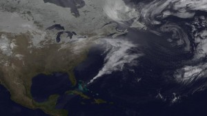
 Satellites provide dramatic views of clouds, but in order to understand the processes that underlie how clouds form and evolve, scientists turn to complex computer models that simulate Earth’s atmosphere. By feeding a range of ground, aircraft and satellite data into Goddard’s Earth Observing System Model (GEOS-5), research meteorologists can see how closely the mathematical equations used to simulate atmospheric dynamics match reality. Such models are by no means perfect, but they have improved tremendously in recent years. The visualizations below, based on GEOS-5 model runs from February 2010, show how well the model reproduced the massive blizzard known as “Snowmaggedon.” In the visualization, watch Snowmaggedon’s sprawling, comma-shaped cloud system—complete with a tail that reaches all the way to the Caribbean—as it churns up the Eastern Seaboard dumping three feet of snow in some areas.
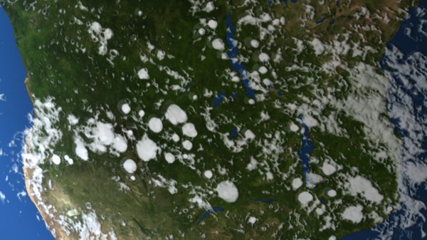
 Ever notice how in many parts of the world, puffy, cauliflower-shaped cumulus clouds are more common in the summer? There’s a reason for this: thermal convection. In winter, the sun has less time to heat the surface and cause instability in the atmosphere. But during the summer, heat from the sun warms the land surfaces so much that pockets of hot air—scientists call them thermals—bubble upward much like steam in a pot of boiling water. As the hot air rises, the water vapor trapped within condenses into microscopic cloud droplets. If the air is humid enough, rapidly changing cumulus clouds puff up in the atmosphere, sometimes bulging to heights above 39,000 feet. Watch in the visualizations below—based on a climate model that simulated cloud formation during a Southern Hemisphere summer—how cumulus clouds pop up over the forests of Africa and South America.

