Science writer, editor, author
Portfolio
Hello, I’m a science writer and editor based in Washington, D.C. I cover the earth sciences from a satellite perspective for NASA’s Earth Observatory website, where I write about everything from wildfires and droughts to climate change, geology, and urban growth.
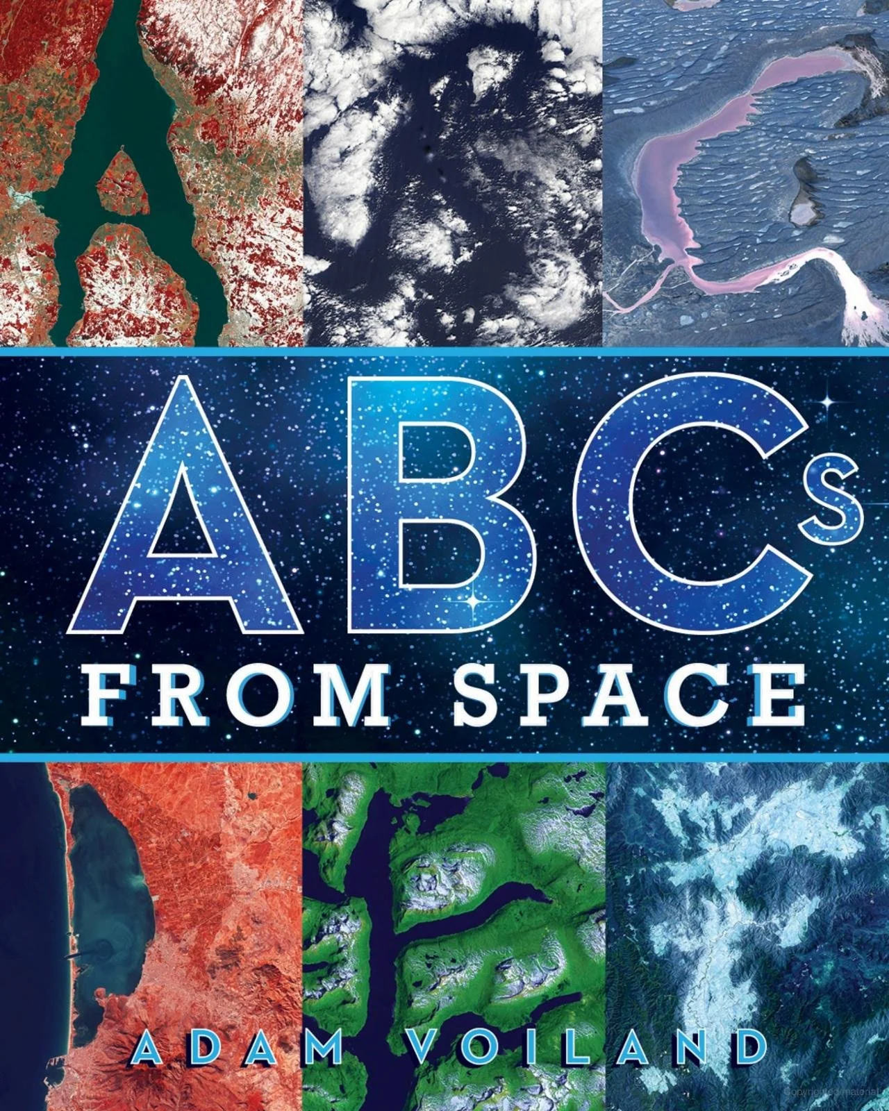
Beyond NASA, I have reported on health and medicine for U.S. News & World Report and freelanced for outlets including Popular Science, Runner’s World, Earth, Greater Greater Washington, and Streetsblog. I’m also the author of the award-winning children’s book ABCs From Space: A Discovered Alphabet.
I hold a master’s in science writing from Johns Hopkins University and a bachelor’s in geology–biology from Brown University. In an era awash with misinformation and AI noise, I believe fact-checking and clear sourcing matter more than ever.
Writing Samples
-
![]()
The Allure of Searles Lake Salts
Evaporite minerals from Searles Lake have similarities to minerals found on the asteroid Bennu.
-
![]()
The Fast Fire Threat
Two decades of satellite data show that the most destructive U.S. fires burn in grasslands and shrublands fanned by strong winds.
-
![]()
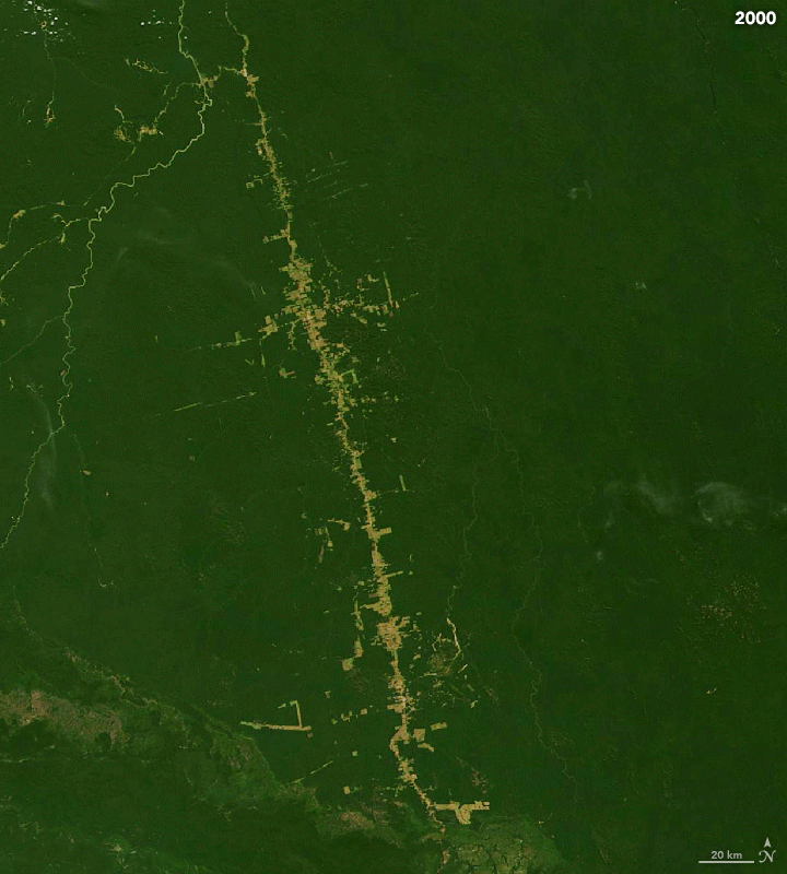
Making Sense of Amazon Deforestation Patterns
It all begins with an idea. Maybe you want to launch a business. Maybe you want to turn a hobby into something more.
-
![]()
Arkansas Farmers Face Lingering Floodwaters
Many growers have been forced to replant as a prolonged flood killed off crops in the Arkansas Delta.


Data Viz Collaborations
-
![]()
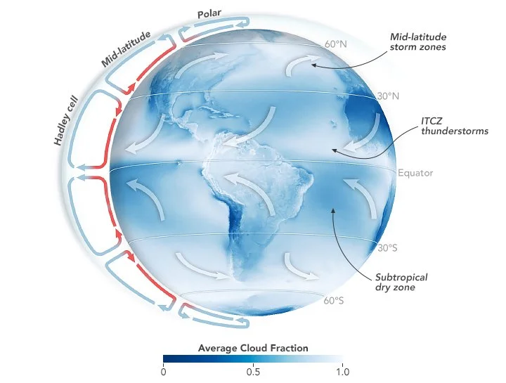
Earth’s Clouds on the Move
Marine storm cloud zones have shifted poleward and narrowed, and the changes are contributing to our planet’s growing energy imbalance.
-
![]()
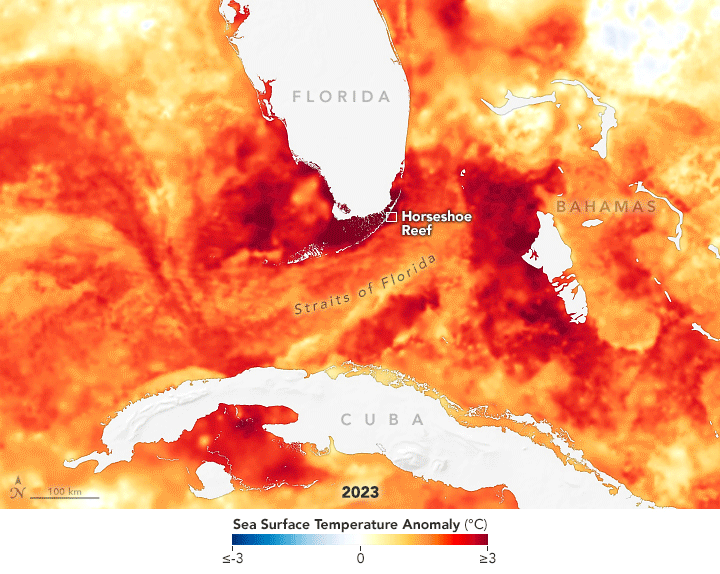
Confronting Florida’s Coral Collapse
After a brutally hot summer in 2023 that caused widespread bleaching and coral death, summer 2024 was more favorable for the state’s vulnerable reefs.
-
![]()
Weather Whiplash
The configuration of the polar vortex may have played a role in unleashing bitter cold followed by record warmth in North America.
-
![]()
America’s Sinking East Coast
Critical infrastructure is threatened as sinking land amplifies global sea level rise.


“Young children will find the alphabet in amazing places in ABCs from Space, an abecedary composed of distant landforms, cloud formations, and sinuous waterways.
”
“Twenty or so years from now, we may point to this book as the launchpad for the careers of astrophysicists and astronauts.
”
ABCs From Space:
A Discovered Alphabet
Look up! Does that cloud look like an animal? Do the stars form a circle in the sky? But have you ever wondered what our world looks like from space? Discover the alphabet in an all-new way with this picture book filled with images of Earth from space.
Voiland takes us on a journey of our planet from afar. And you might be very surprised at what you see. Could that river form an A? Could those clouds form a B? These awe-inspiring and unaltered images of Earth from above showcase the diversity and beauty of our amazing planet in a special and unique way.
From A to Z, ABCs from Space is a rare opportunity to see Earth like you could never have imagined. And as you go through the book, play a guessing game of where and what the letters might be and then find the answers in the detailed descriptions in the back of the book along with information about the science of space.
