Archives for category: NASA

In March 2012, a magnitude 9.0 earthquake—the fourth largest recorded since 1900—triggered a powerful tsunami that pummeled the northeastern coast of Japan. The earthquake occurred offshore, about 130 kilometers (80 miles) east of Sendai at 2:46 p.m. on March 11. Within 20 minutes, massive swells of water started to inundate the mainland.

The tallest waves and most devastating flooding from the 2011 T?hoku-oki tsunami occurred along the jagged coast of northern Honshu, a landscape dimpled with bays and coves known as ria coast. The steep, narrow bays of ria coasts trap and focus incoming tsunami waves, creating destructive swells and currents that can push huge volumes of water far inland, particularly along river channels.

That’s exactly what happened in the days before the Advanced Spaceborne Thermal Emission and Reflection Radiometer (ASTER), an instrument on NASA’s Terra satellite, captured the middle image above (on March 14, 2011). It shows severe flooding along the Kitakami River three days after the earthquake struck.

Earth Observatory, March 2012


A new NASA study underscores the fact that greenhouse gases generated by human activity — not changes in solar activity — are the primary force driving global warming.

The study offers an updated calculation of the Earth’s energy imbalance, the difference between the amount of solar energy absorbed by Earth’s surface and the amount returned to space as heat. The researchers’ calculations show that, despite unusually low solar activity between 2005 and 2010, the planet continued to absorb more energy than it returned to space.

James Hansen, director of NASA’s Goddard Institute for Space Studies (GISS) in New York City, led the research. Atmospheric Chemistry and Physics published the study last December.

Total solar irradiance, the amount of energy produced by the sun that reaches the top of each square meter of the Earth’s atmosphere, typically declines by about a tenth of a percent during cyclical lulls in solar activity caused by shifts in the sun’s magnetic field. Usually solar minimums occur about every eleven years and last a year or so, but the most recent minimum persisted more than two years longer….

NASA, January 2012

A Less Hardy Hardiness Map

The USDA has unveiled a new version of its plant hardiness map, which gardeners use to gauge which plants will survive in which climate zone. (Check your nearest seed packet.)  In the newest iteration, many zones have shifted northward because winters aren’t as cold as they were 22 years ago when the agency last updated the map — good news if you’re trying to grow, say, figs in Boston. On the new map, most parts of the United States are a half-zone warmer — about 5 degrees Fahrenheit (2.7 Celsius). Global warming surely underlies much of the change, but theUSDA points out that more sophisticated mapping techniques, plus the inclusion of data from additional weather stations, has also affected the distribution of the zones.

Why the Arctic Ocean Isn’t Freshening
Rapid freshening on the North American side of the Arctic Ocean in recent decades has prompted speculation that rapid melting of sea ice might be causing a slowing of the “conveyor belt” that keeps water circulating through the world’s oceans. New research led by scientists at the University of Washington helps allay such fears. The researchers conclude that freshwater from the Eurasian part of the Arctic Ocean, which comes originally from rivers in Russia, has simply found a new route that brings more of it toward Canada. The cause for the new freshwater route: changes in winds associated with a weather patternknown as the Arctic Oscillation. In fact, the analysis of satellite and oceanographic data shows that overall salinity in the Arctic Ocean remained constant between 2005 and 2008; as the Canadian portion became fresher, the Eurasian portion grew saltier. The shifting path of the fresh water is shown in red in the animation below.

[yframe url=’http://www.youtube.com/watch?v=y8diuqAI6YA&feature=player_embedded’]

Temperature Ranking-palooza
There’s always a flurry of media activity in January when scientists at NASANOAA, and the UK Met Office tally up the year’s temperature measurements and rank how warm the past year was. This January was no exception. In NASA’s analysis, 2011 came in as the 9th warmest year on the modern meteorological record. However, the longer-term trends are what really matter. Look at the whole record – and here are a fewinteractive charts that are useful for doing that – and it’s clear that the last decade has been the hottest on record. Another remarkable stat: 9 of the 10 hottest years have occurred since 2000. For more details, the science team that manages NASA’s analysis has published a thorough temperature update here.

Earth Observatory, January 2012

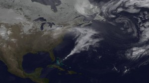
Satellites provide dramatic views of clouds, but in order to understand the processes that underlie how clouds form and evolve, scientists turn to complex computer models that simulate Earth’s atmosphere. By feeding a range of ground, aircraft and satellite data into Goddard’s Earth Observing System Model (GEOS-5), research meteorologists can see how closely the mathematical equations used to simulate atmospheric dynamics match reality. Such models are by no means perfect, but they have improved tremendously in recent years. The visualizations below, based on GEOS-5 model runs from February 2010, show how well the model reproduced the massive blizzard known as “Snowmaggedon.” In the visualization, watch Snowmaggedon’s sprawling, comma-shaped cloud system—complete with a tail that reaches all the way to the Caribbean—as it churns up the Eastern Seaboard dumping three feet of snow in some areas.

NASA Visualization Explorer, January 2012 

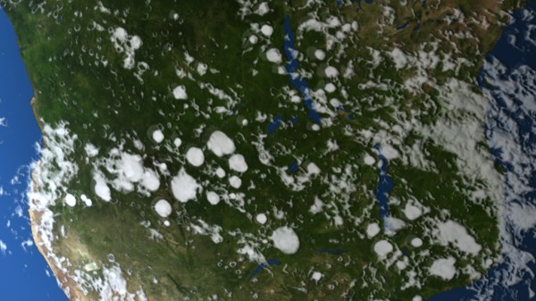
Ever notice how in many parts of the world, puffy, cauliflower-shaped cumulus clouds are more common in the summer? There’s a reason for this: thermal convection. In winter, the sun has less time to heat the surface and cause instability in the atmosphere. But during the summer, heat from the sun warms the land surfaces so much that pockets of hot air—scientists call them thermals—bubble upward much like steam in a pot of boiling water. As the hot air rises, the water vapor trapped within condenses into microscopic cloud droplets. If the air is humid enough, rapidly changing cumulus clouds puff up in the atmosphere, sometimes bulging to heights above 39,000 feet. Watch in the visualizations below—based on a climate model that simulated cloud formation during a Southern Hemisphere summer—how cumulus clouds pop up over the forests of Africa and South America.

NASA Visualization Explorer, January 2012

A new study led by a NASA scientist highlights 14 key air pollution control measures that, if implemented, could slow the pace of global warming, improve health and boost agricultural production.

The research, led by Drew Shindell of NASA’s Goddard Institute for Space Studies (GISS) in New York City, finds that focusing on these measures could slow mean global warming 0.9 ºF (0.5ºC) by 2050, increase global crop yields by up to 135 million metric tons per season and prevent hundreds of thousands of premature deaths each year. While all regions of the world would benefit, countries in Asia and the Middle East would see the biggest health and agricultural gains from emissions reductions.

“We’ve shown that implementing specific practical emissions reductions chosen to maximize climate benefits would also have important ‘win-win’ benefits for human health and agriculture,” said Shindell. The study was published today in the journal Science.

NASA, January 2012